Table of Contents
The pandemic has been a game-changer in the field of home design. With the rise of COVID-19, we spend tons of quality time indoors. Leave alone working out and working remotely. Because a ‘homo pandemicus’ spends the majority of their life at home, designers strive for coziness. Warmth and lightness are the main themes that functionality and aesthetics follow.
Color schemes are the best elements to transfer the feeling of warmth and serenity in the interior. Want to decorate your dorm or apartment? Check out which colors to choose while staying authentic and trendy at the same time.
Why is Minimalist Design Getting Popular?
The minimalist philosophy is a crucial part of sustainable living. During the last decade, minimalism gained its popularity due to Millenials. The youngest generation (along with GenZs) is known for caring about Mother Planet. Before you reach an essay service online to compose a paper on how to change the world, start with yourself. Namely, with your living space.
Before throwing your old couch away and buying an eco sofa, learn about the pros and cons of minimalist space.
Pros
- You will minimize your carbon footprint substantially. No more plastic from Ikea and Christmas lightings lasting for only one holiday season;
- You will possess less disposable objects. In general, your possessions will be at the minimum, which will save you money;
- When adding new 2022 color trends to your space, you’ll feel calm and relaxed. All because the color schemes are light and earthy.
Cons
- Well, no more shopping at Ikea;
- Those good old capitalists will give you a headache each time you explain why buying less is great;
- Some vintage items might be expensive.
#1: Airy Palette – Blues and Greens
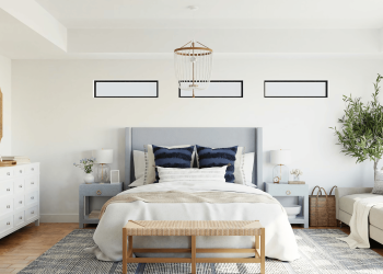
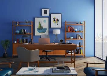
The first thing which comes to one’s mind when thinking of air is lightness. Subtle colors like blues and greens will not leave the design ‘catwalk.’ Add eggshell hues and grayish shades, and you get a light, gentle space. When added to details, secondary hues like cold violet will refresh the interior.
Some Tips to Consider
- When choosing airy colors, follow the cold palette;
- White works best with airy colors;
- Avoid furniture with too many decorative elements or dark wood. When added to the airy palette, the combination will feel heavy;
- To decorate walls, hang a few watercolors.
#2: Floral Hues
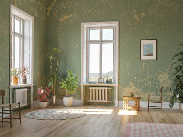
What can give you more peace and calm than wallpaper flowers? We don’t suggest you go all Grandma. Use retro elements wisely. Just think of desaturated minty shades in fresh floral prints. The best-looking design is muted colors on a white background. The whole idea of a desaturated palette is that everything fades with time. A perfect spot for meditation and relaxation!
Some Tips to Consider
- Avoid pictures with piled-up details. With the composition looking messy, they’d distract the viewer from the print. Ever heard of the ‘Black Square’ by Malevich? Take the idea, but substitute the canvas with a different color;
- Muted floral patterns work perfect when paired with light, airy designs.
#3: Clean Palette – White and Cotton
Which is the maximum minimalist (pun intended) color? Obviously, the white color and everything which reminds the viewer of it. We don’t suggest you cover all four walls in white or buy white furniture. In fact, think of desaturated beiges and the hues of cotton and linen. Keep the space airy and light.
To get the deepest palet understanding, think of a modern farmhouse. TV shows like ‘Anne with an E’ will help your imagination.
Some Tips to Consider
- Use the white-and-cotton pallet to connect big color spaces with each other;
- Light wooden furniture and linen cushions work great with this pallet;
- Avoid heavy prints and geometry as well as over-decorated furniture.
#4: Natural Greens
Green will fairly take first place in the hierarchy of 2022 colors. Obviously, green is the color most connected to nature yet sustainable living. Think of the color names: ‘guacamole,’ ‘olive,’ ‘thyme,’ ‘rosemary,’ etc. Oh, don’t forget avocado!
Some Tips to Consider
- Deep saturated greens look good when combined with dark wood furniture;
- Dim olive shades make majestic monochromatic walls. Add linen bed covers and put a high vase with dry yellowish flowers on the floor;
- Green symbolizes the human desire to connect with nature. Hence, locating greens in rooms with big windows is a good idea.
#5: Earth and Sand
We’ve been spending too much time at home. Hence, no wonder most of us want to welcome nature without leaving the comfort of our houses. When one thinks of earth and sand, two main colors popping up in their mind are brown and yellow. However, everything depends on one’s personal taste. You can use soft natural pastels like beiges and neutral yellows. Or you can choose saturated sandy hues and burnt brownish shades.
Some Tips to Consider
- The earth-and-sand palette goes well with white and cream hues;
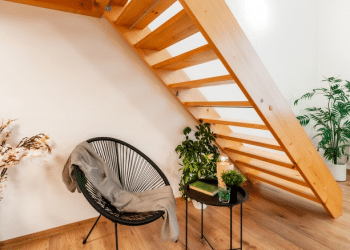
- Add some raw materials to the interior like sandalwood;
- Both brown and yellow are associated with warmth and coziness. We advise you to welcome the galore of soft woven blankets, grasscloths, and layered rugs;
- Wooden furniture and wooden floors work great when coupled with this palette.
#6: The Neutral-Plus-Vibrant Formula
If going pale-green is not your piece of cake, try a different color scheme. To bring more energy to your living space, add bright details. Leave the majority of your space neutral. Most people would choose the beautiful grayish shade with a subtle red hue.
Paint the walls in a neutral color. Later, add one or two saturated shades of your favorite color. For instance, you might find a bright pleated lampshade adorable.
Some Tips to Consider
- Grayish shades work the best for the background;
- You can paint a mural in all shades of one dominant vibrant color. Don’t forget to keep the background gray;
- Bright monochromatic furniture and wallflowers in bright pots will complement the space.
Final Thoughts
Subtle shades and minimalism are popular among Millennials. In the age of environmental awareness, living sustainably is the key to inner peace and harmony. So choose the color scheme that brings you happy memories. Do floral prints allude to your Grandma’s house? Then go for them! No wonder the 2022 color palettes are called ‘new traditional’ style.
We hope the article was helpful to you. Good luck!


