Table of Contents
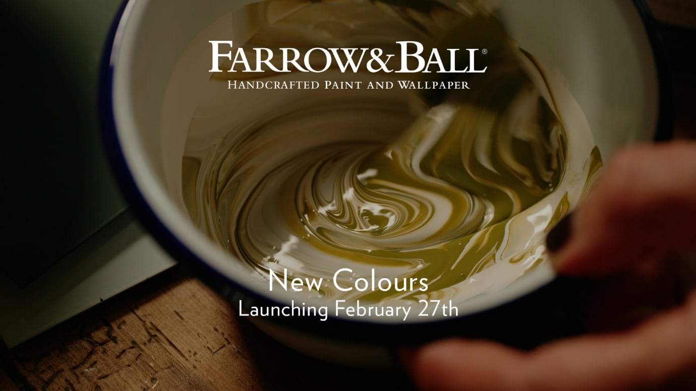
On February 27th, Farrow & Ball will be moving 12 dazzling shades into their main range – nine of them all-new and the remaining trio brought in from the Farrow & Ball Archive.
It’s been 3 years, and the paint and decorating world is on the edge of its seat. Since Farrow & Ball’s last update to their principal 132-colour range back in 2022, interior designers and DIY hobbyists alike have been hedging their bets on when we’d be likely to see another switch-up.
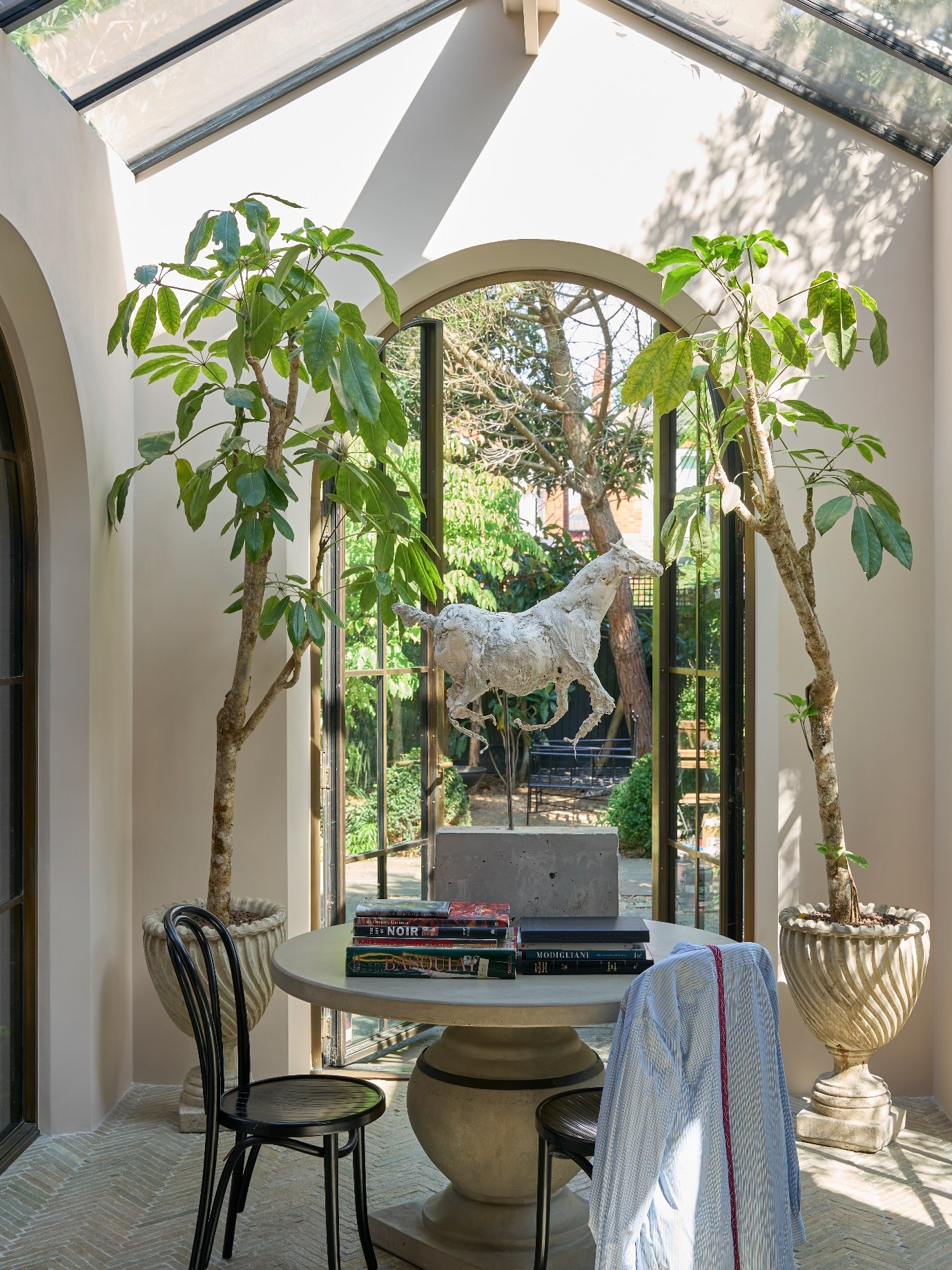
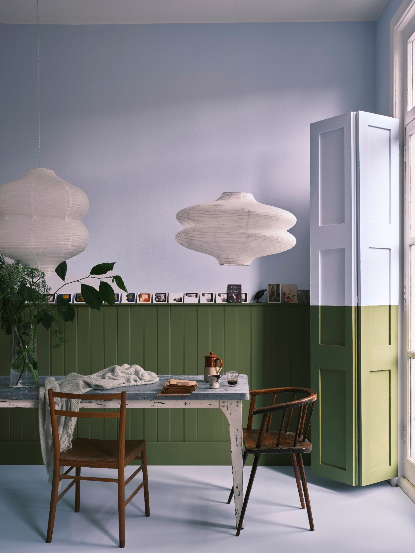
Farrow and Ball’s new colours for 2025 are exactly that: a switch-up. Long gone are the jubilant, candy-toned shades from their Carte Blanche capsule collection; similarly, stark greys and crisp neutrals are nowhere to be seen. Today, changing interior design tendencies are ushering in a new era of down-to-earth shades ranging from toasty terracottas to healing earthy greens.
An Earthy Era for Farrow & Ball
Three years in the making signals a huge shift in design trends. While Farrow & Ball have been gleaning inspiration from the natural world and closer to home (see Naperon No.315’s etymologic root in the humble apron), the world’s appetite for heartening interiors has only snowballed.
Sticking to their mantra of not following trends but developing them, Farrow & Ball HQ has absorbed our collective longing for nature and everyday comforts. From warming foods to domestic memories, Farrow & Ball’s new colour selection for 2025 is all about telling the story behind the overlooked details of our childhood.
New Takes on Familiar Colours
From familiar memories to familiar hues. Farrow & Ball, for the first time, is welcoming new creations alongside revived archival colours. With Etruscan Red No.56, Broccoli Brown No.198 and Sap Green No.199 returned to the current 132 main shades, it’s intriguing to see how they pair up with the newer entries. Joa Studholme and co. are really bringing new meaning to bringing out the new in the old.
First, a handful of goodbyes…
With the 12 new Farrow & Ball colours taking centre stage, these dozen have been switched out into the Archive. Of course, they’ll be attainable at your local decorating shop while stock lasts and you can get your hands on a tester pot, but from late February you will have to sample these archive colours online.
There’s no better time to stock up on these colours than now:
- Bone No.15
- London Stone No.6
- Manor House Grey No.256
- Pelt No.254
- London Clay No.244
- Middleton Pink No.245
- Rectory Red No.217
- Blue Ground No.210
- Green Ground No.206
- Citron No.74
- Rangwali No.296
- Ball Green No.75
Introducing the new additions to Farrow & Ball’s main colour range
Without further ado, here are Farrow & Ball’s new colours that will be making a home in their iconic 132 signature shade range.
Scallop No.311
Dead Salmon’s lighter sibling, Scallop No.311 is an ethereal, smoky salmon hue named after the shellfish delicacy.
- Complementary white: Dimity No.2008
- Best paired with: Cromarty No.285, Wimborne White No.239, Dead Salmon No.28
Dibber No.312
With its namesake coming from the garden tool used to poke holes in the ground for seeds, cuttings and bulbs, this earthy green is grounding in more ways than one.
- Complementary white: Satin Slipper No.2004
- Best paired with: Inchyra Blue No.289, Off-Black No.57, Old White No.4
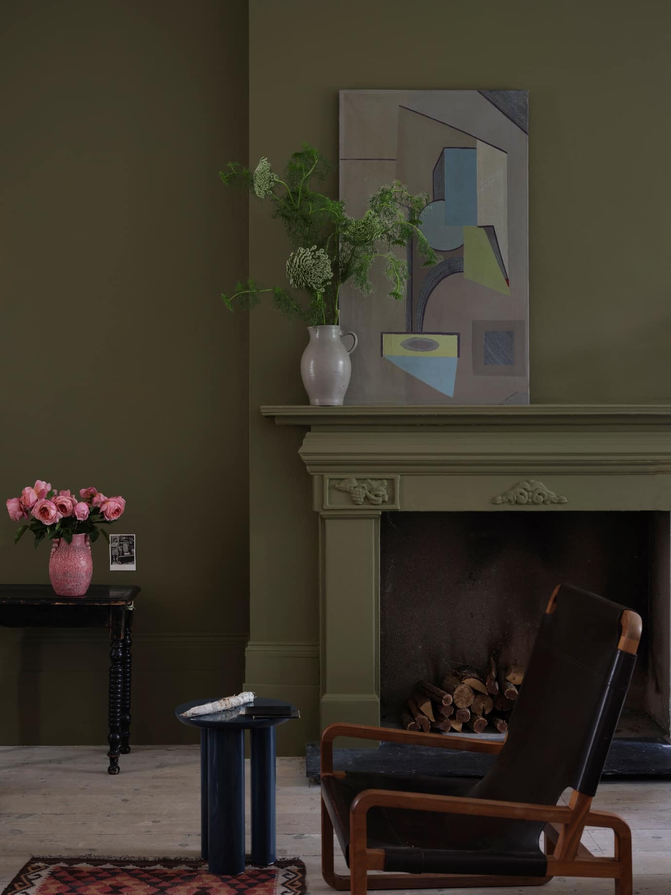
 Reduced Green No.313
 Reduced Green No.313
Another wonderfully earthy green, but darker in tone than Dibber, is Reduced Green No.313. Shifting between woody green and dark brown, its dash of green pigment makes this neutral gorgeously nuanced.
- Complementary white: Old White No.4
- Best paired with: French Gray No.18, Preference Red No.297, Templeton Pink No.303
Sizing No.314
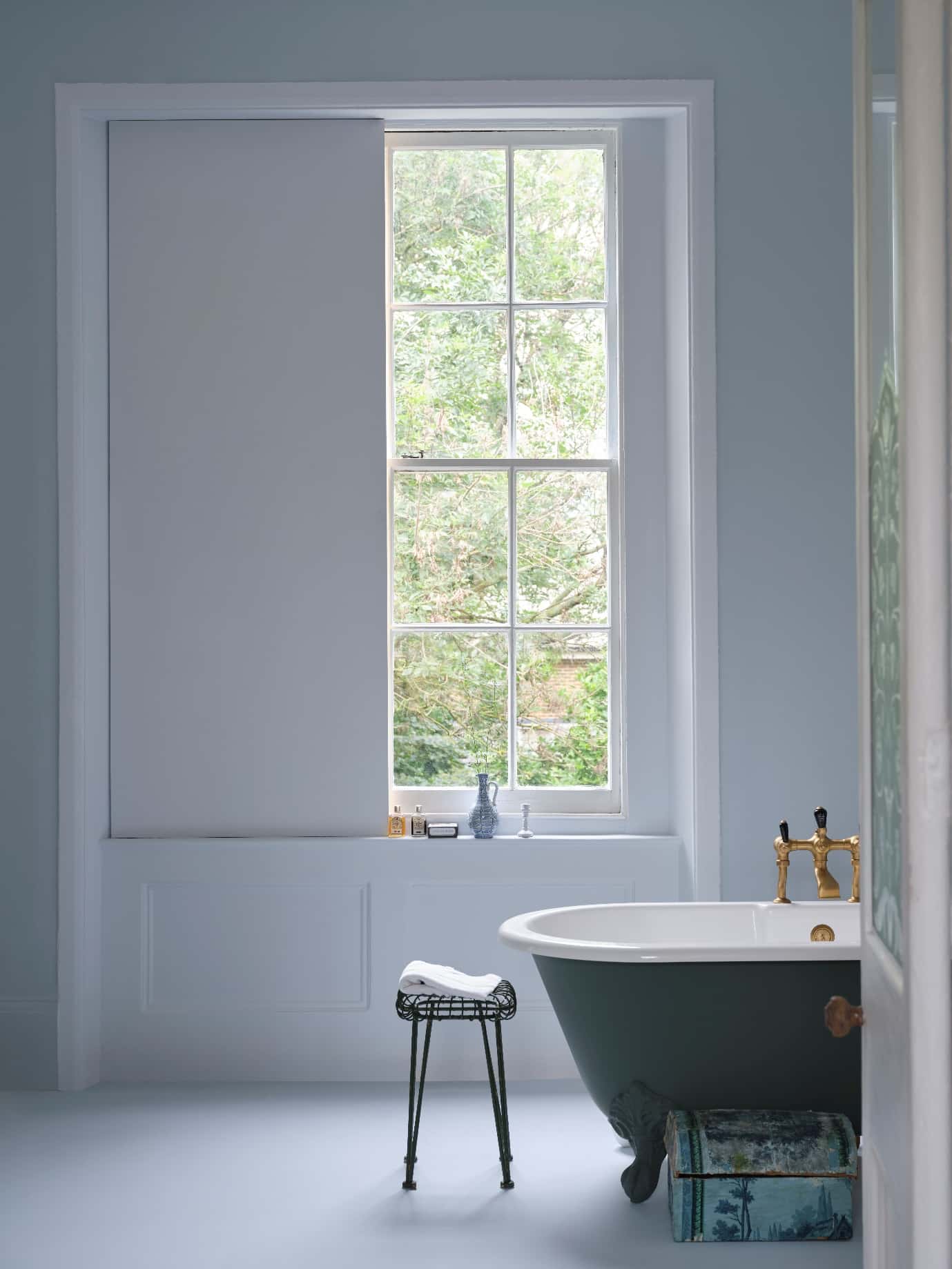
Light, airy and refined, this pale blue is inspired by the starch of the same name and its signature crispness.
- Complementary white: All White No.2005
- Best paired with: Wine Dark No.308, Tailor Tack No.302
Naperon No.315
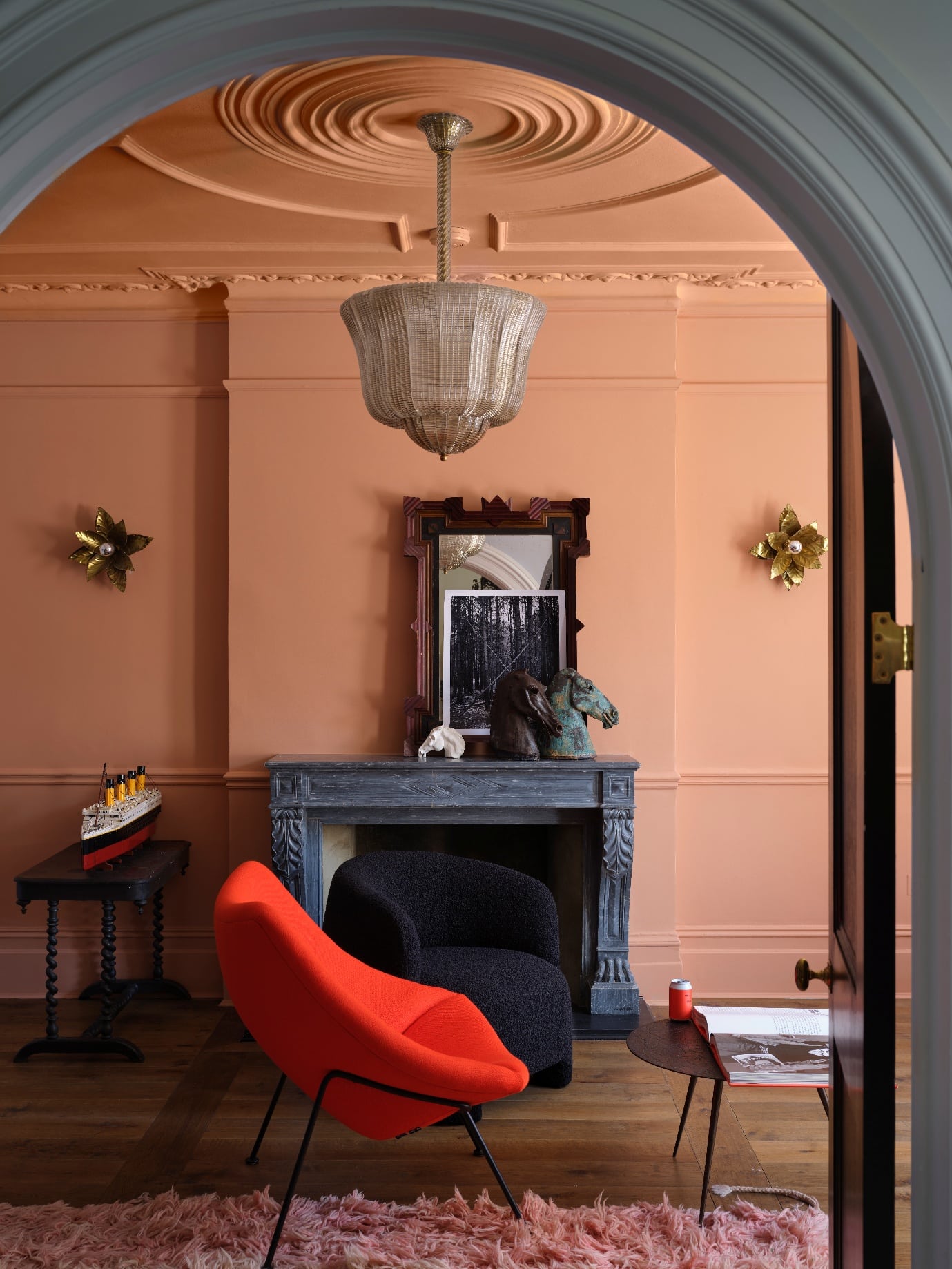
Similar to Faded Terracotta No.CC8 but more pinkish in tone, this is a lovely addition to Farrow & Ball’s clay shades. Its name comes from the etymology of the word apron, signalling its domestic warmth.
- Complementary white: Stirabout No.300
- Best paired with: Dibber No.312, Joa’s White No.226, Lichen No.19, Lime White No.1
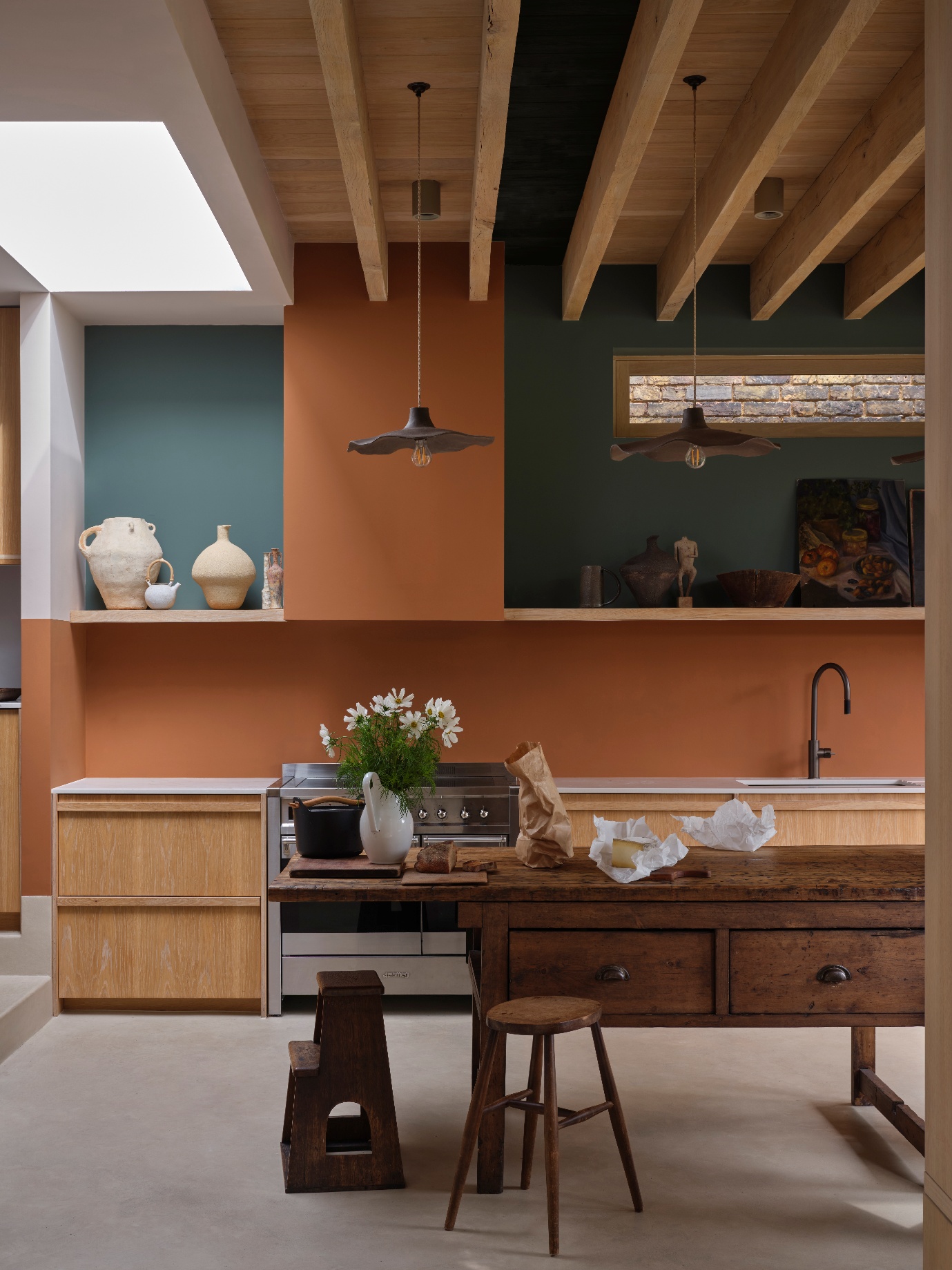
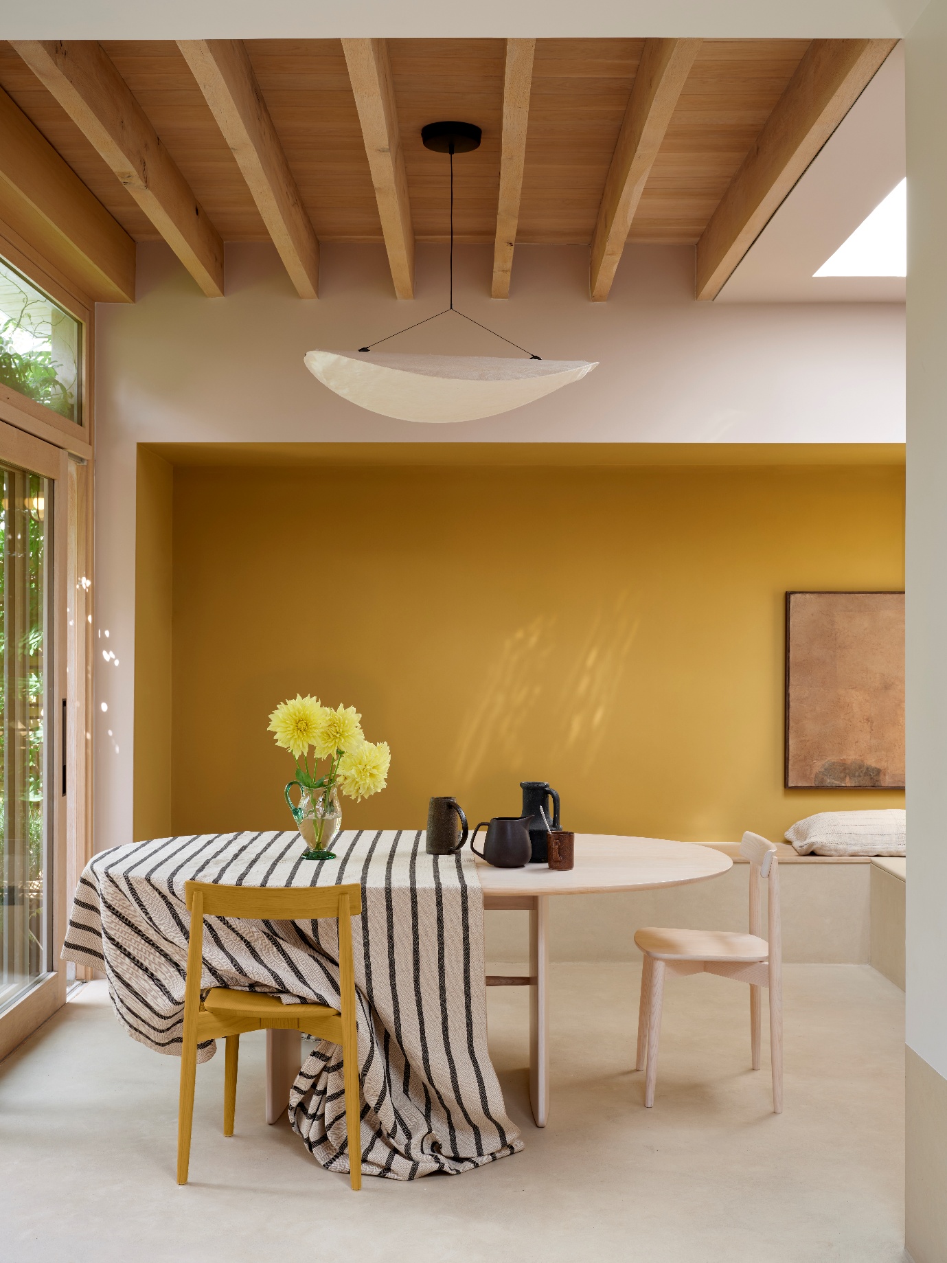
Marmello No.316
An orangey brown, this shade was influenced by the marmello quince and origins of marmalade. We get the same comforting appeal in the paint.
- Complementary white: Joa’s White No.226
- Best paired with: Stirabout No.300, Jitney No.293, Etruscan Red No.56, Mahogany No.36
Kakelugn No.317
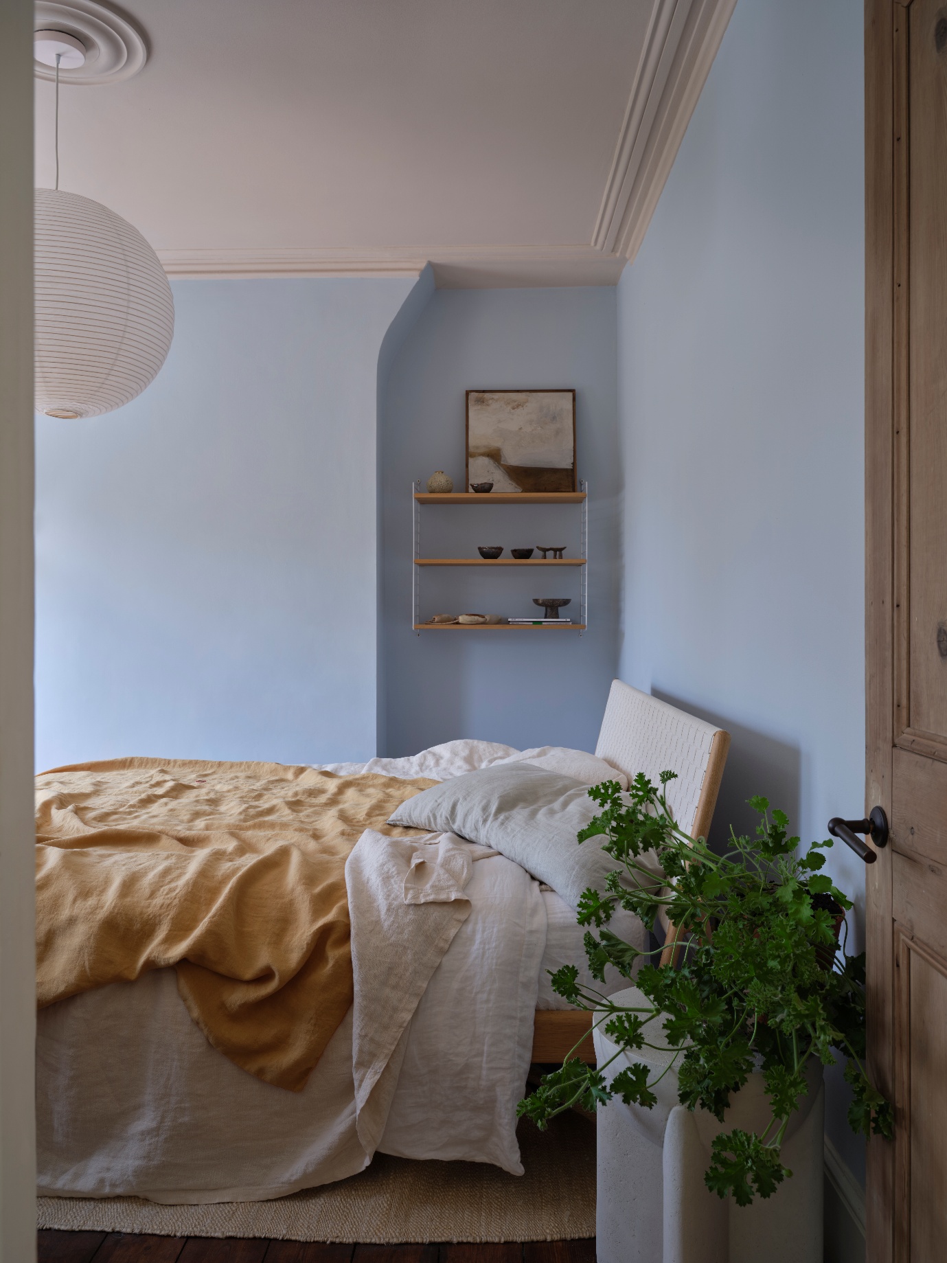
A smidge more vibrant than Sizing is Kakelugn No.317, another wistful pale blue. This new Farrow & Ball colour is their response to the many requests for a cleaner interpretation of Light Blue.
- Complementary white: Strong White No.2001
- Best paired with: Hague Blue No.30, Bamboozle No.304, Calamine No.230, Wimborne White No.239
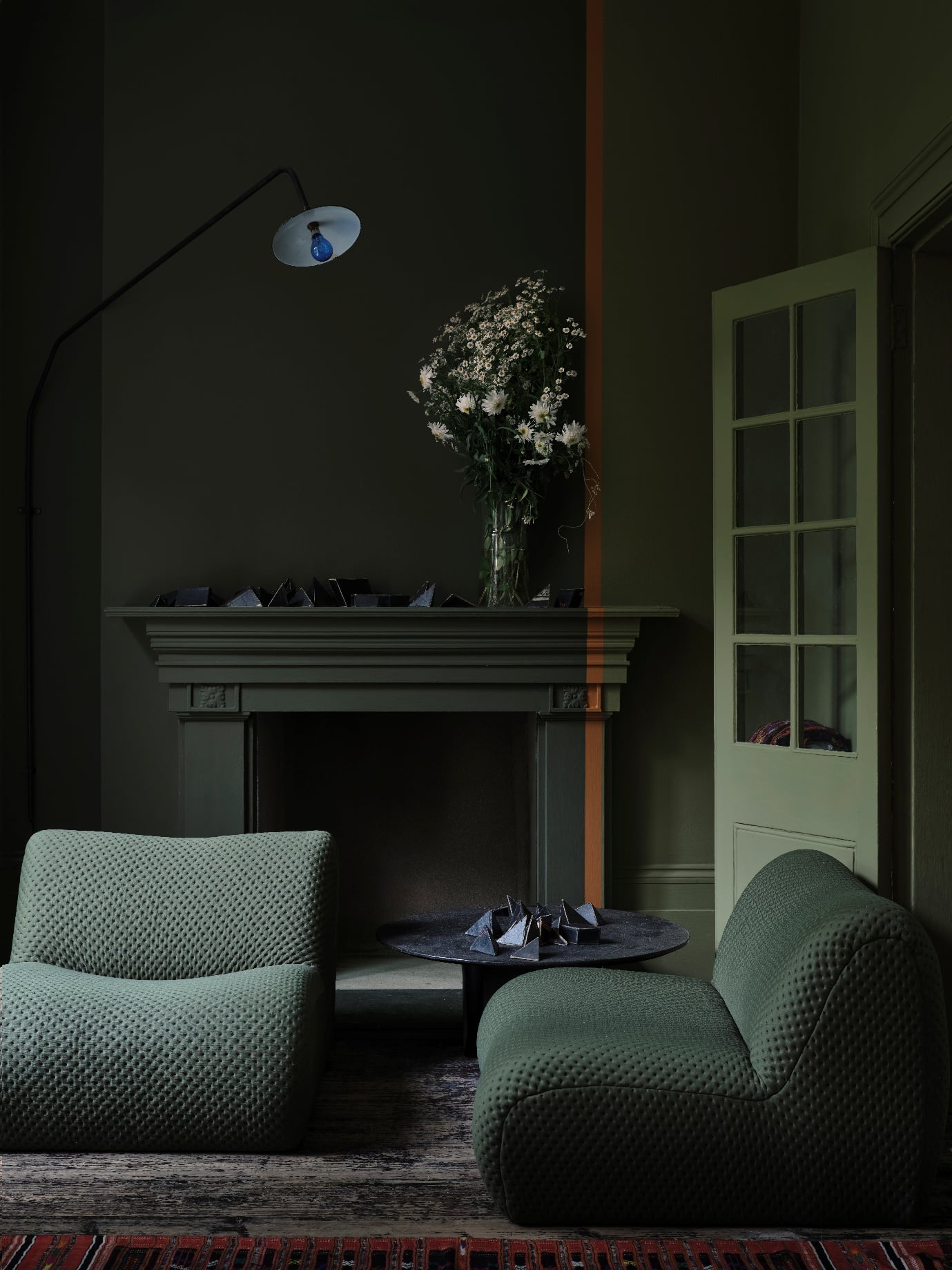
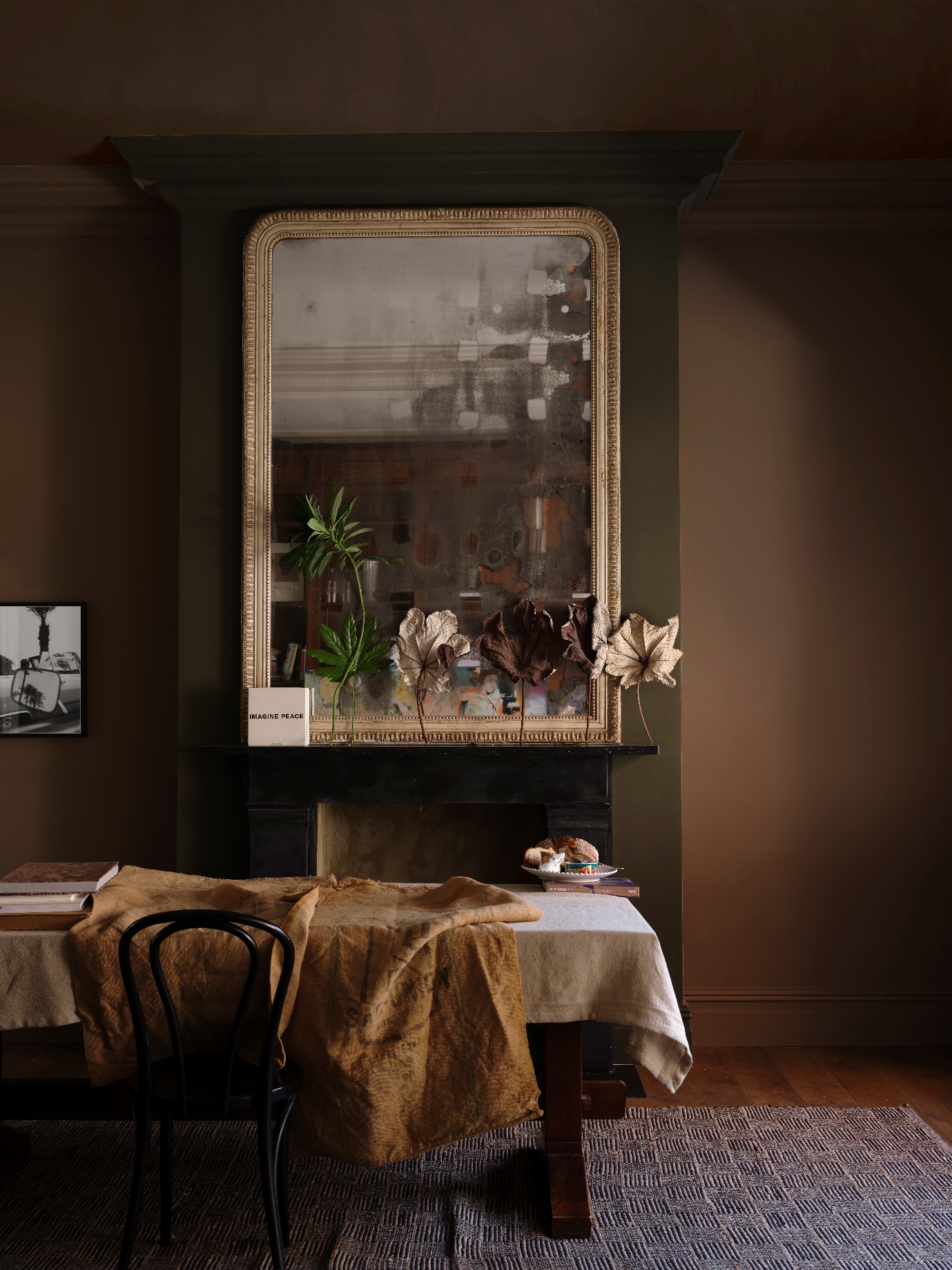
Douter No.318
With a somewhat mystifying name originating from the sooty brass candle snuffers from days gone by, Douter nestles comfortably between other grey-toned greens like Inchyra Blue and Green Smoke.
- Complementary white: Shaded White No.201
- Best paired with: Scallop No.311, Shadow White No.282, Mouse’s Back No.40
Duster No.319
Another nostalgic ochre to join Farrow & Ball’s iconic yellows, Duster is an aged yellow reminiscent of the cleaning cloth we see at home.
- Complementary white: Lime White No.1
- Best paired with: Satin Slipper No.2004, Old White No.4, Reduced Green No.313
From the Archive
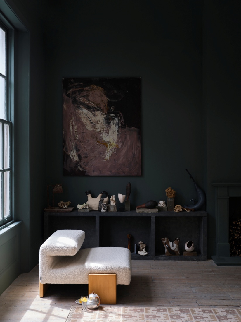
Now, on to the archived trio of paints. Those with keen eyes will notice something of a pattern; here, it’s all about deep, earthy tones exhumed from the ground itself!
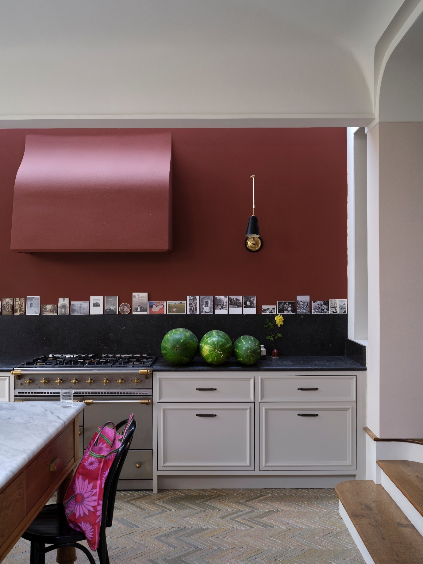
Etruscan Red No.56
Ideal for countering the cooler light of a north-facing room, Etruscan Red is a versatile add-on to their earth tones. With deep brown pigment, it’s not quite as intense as Preference Red, but it still leaves an impact.
- Complementary white: Lime White No.1
- Best paired with: Duster No.319, Reduced Green No.313, Oxford Stone No.264, Dimity No.2008
Broccoli Brown No.198
Delicious as the fried vegetable, this stoney brown shade hauls nature into your interiors. Striking a delicate balance between cosy and refined, it’s the best of both worlds.
- Complementary white: Stirabout No.300
- Best paired with: Scallop No.311, Card Room Green No.73, Beverly No.310, Studio Green No.93
Sap Green No.199
Brighter than Olive No.13, this earthy green brings tons of energy into a room, despite being rich and grounded in nature.
- Complementary white: Strong White No.2001
- Best paired with: Sizing No.314, Wevet No.273, Bancha No.298, Pink Ground No.202
Ready to experience the Farrow & Ball magic? You can order from the revamped signature 132 collection from February 27th.